Sel:pH Beauty Packaging Design
Client: RamBam Cosmetics LLC -MAKARI
Category: Print Media | Design | 52. Packaging/Label
About Project
Sel:pH is a brand that empowers people to embrace the things that make them unique, reminding them that our products exist to bring out the best you. Their values are centered on individuality, originality, inventiveness, intrigue, and the power of the pH to celebrate the diversity that is at the core of what makes us ourselves.
Makari asked QNY Creative to design the brand and packaging for their new Beauty adventure: Sel:pH. The goal was to create a unique brand designed specifically for the Gen Z audience. Sel:pH’s ethos is to create personalized skin care products based on the skin’s pH scale, going a step beyond traditional beauty routines, in order to reclaim the power of personal identity.
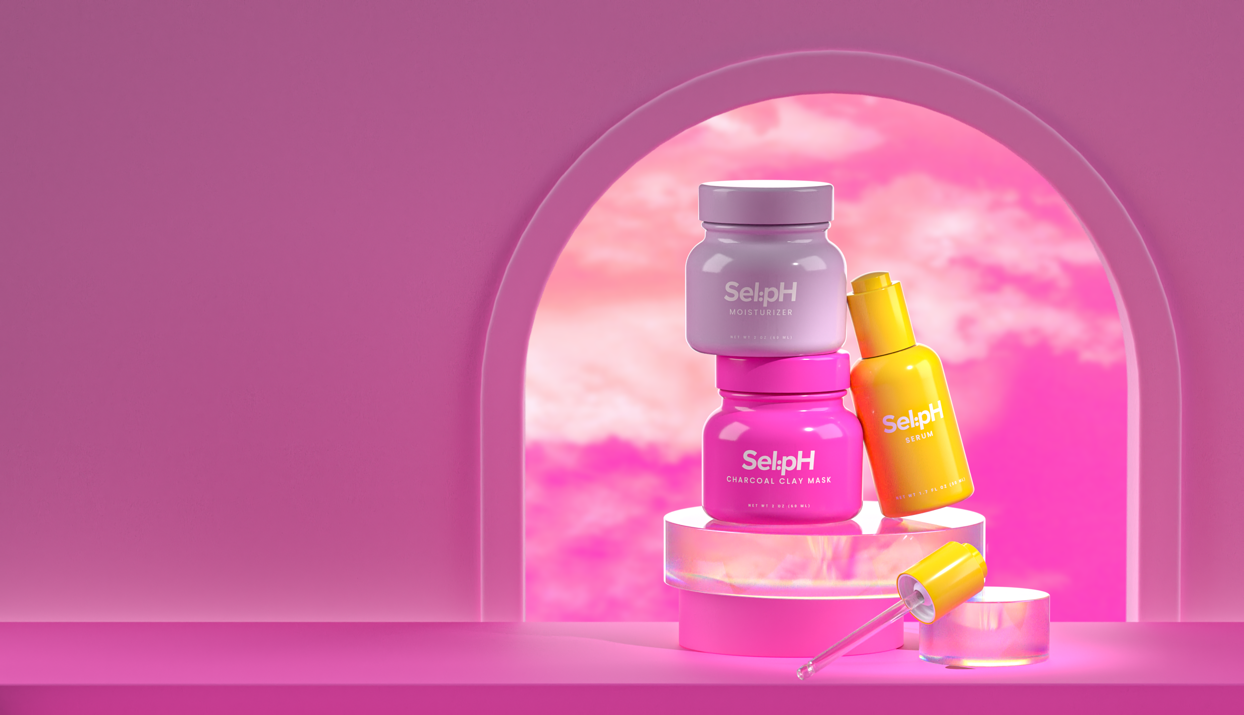
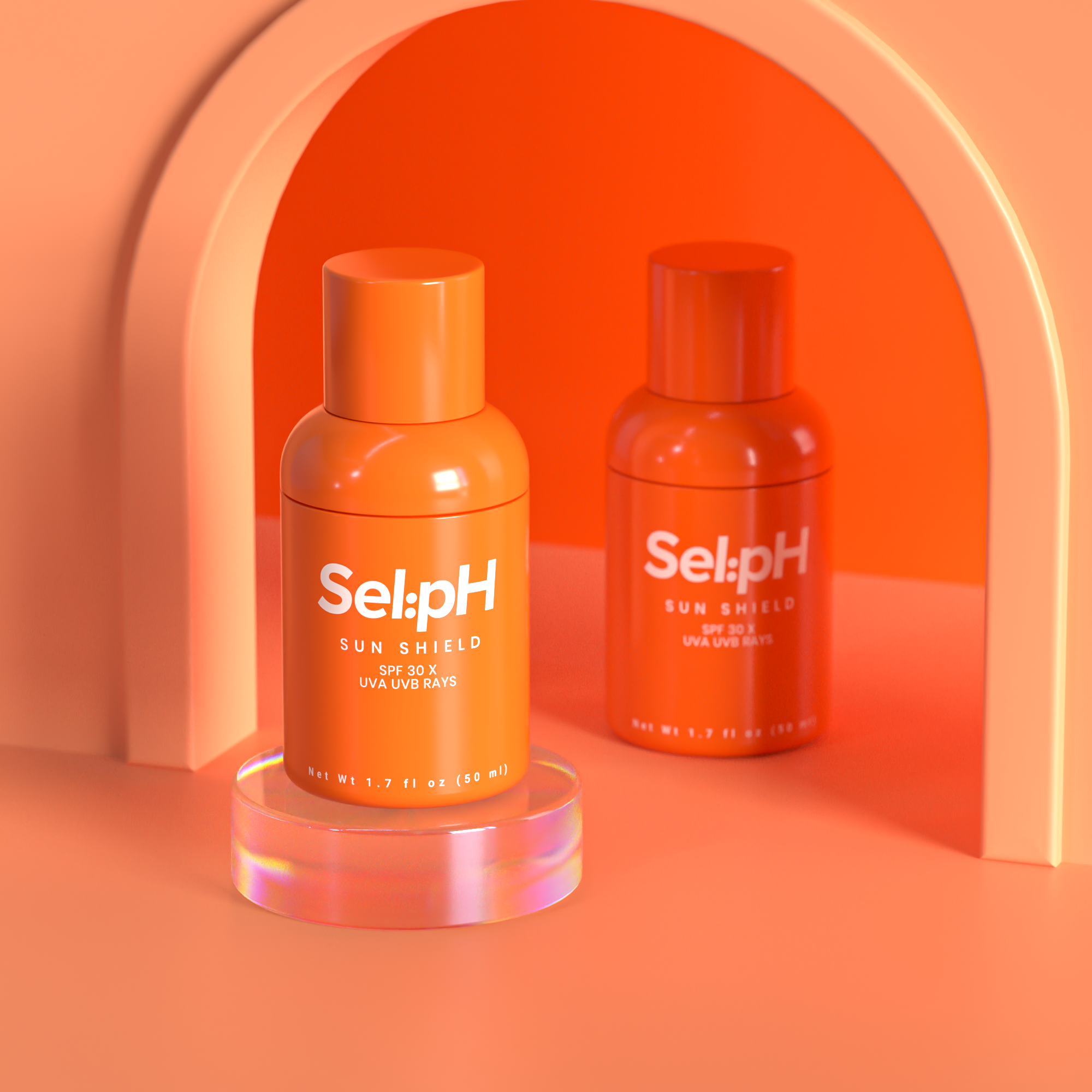
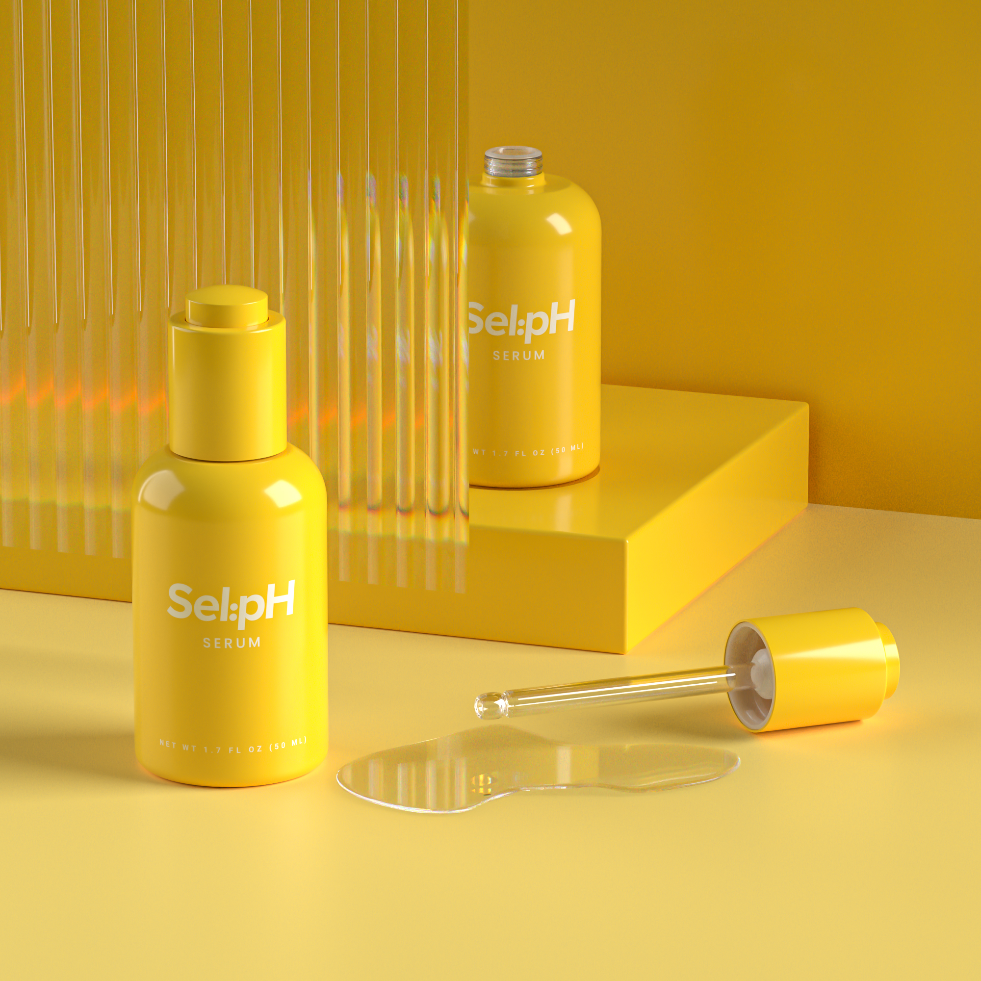
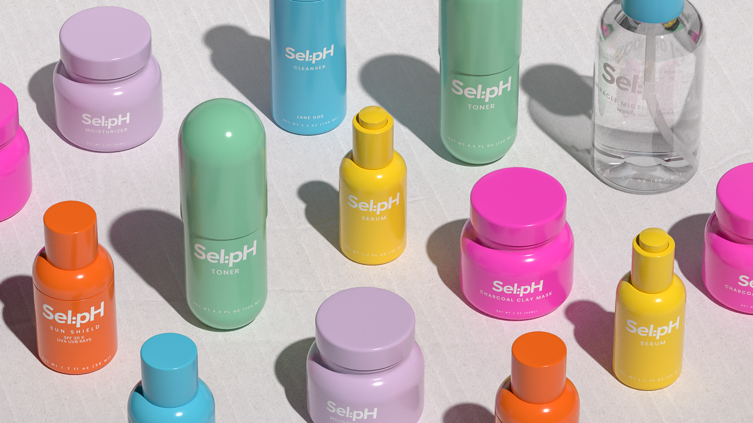
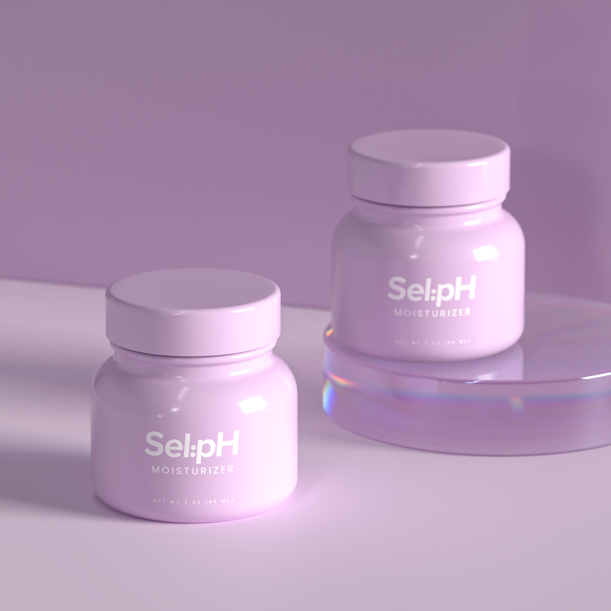
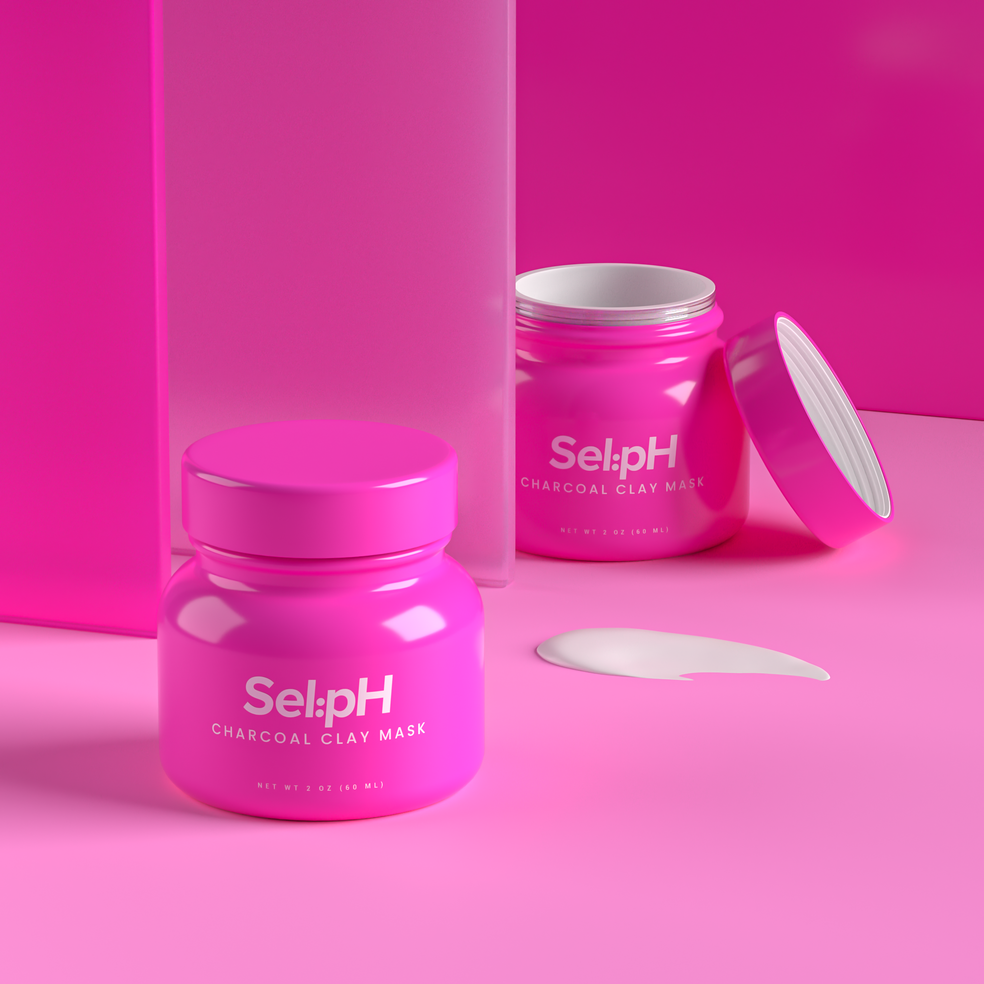
For the branding, we created a bold logo around the pH concept, making it very visual in the way it's written. For the packaging, our team focused on creating a bold and vibrant color palette that would resonate with younger generations, ranging from magenta, yellow, blue, lilac, green, and orange, each color is designated to a product so it's instantly recognizable. Each jar has minimal content, putting only the information that matters: The brand logo, the type of product, and the name of the customer. Since every product is made from a unique formula, we kept the packaging simple, saving all the ingredients information for a complementary postcard that each customer receives when their product arrives.
Made Sel:pHlessly with love, Sel:pH wants their customers to feel unique, to express their own individuality by giving them custom skincare made specifically for each skin type and their own skincare needs.
Credits
Creative Director: Ezio Burani
Art Direction: Ana Camero
Graphic Design: Marija Schmitt
3D Models: Ilya Volgin
Brand Strategy: Anna Urban, Campara Rozina de Haan
Project Management: Marijke Thielen